You probably don’t notice it, but you are a designer on a daily basis. Creativity, art and design are more accessible now than ever before thanks to technology and apps galore. Your website, mobile apps, listing photos – all of it requires design. So, I’m going to take a leap of faith and demand that it be at least good, if not great design. Form and function, typography, kerning, and color are all basic things you can start paying attention to. Here are three to get you started.
TYPOGRAPHY
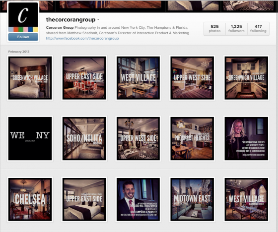
Typography can speak to the brand of your business. The Corcoran Group’s Instagram account is a great example. They think about and execute different sizes and positions of the text on top of their Instagram pictures. When you look at their profile or see a photo in their stream, you immediately know it’s from The Corcoran Group because of the consistency they practice.
Don’t go crazy with the number of different typefaces you use either. A good rule is don’t use more than three.
Kerning is simply the space between two individual letters. We’ve all seen bad kerning and most kerning when done right, goes unnoticed. I love this kerning game. Go on… try it and come back!
P.S. Papyrus, Comic Sans and Brush Script are not acceptable typefaces. Please stop making me cringe. It’s very hard to be taken seriously if you use Papyrus or Comic Sans. Also… see you’re a Comic Sans Criminal.
IMAGERY
Imagery and text can work together beautifully. Images have a huge impact but too much of a good thing can happen if you’re not careful. Think rule of thirds here. Be thoughtful with what you use. Apps like Over and TitleFx are great tools to combine great typography with your photos. Here are some of my favorite examples from INK361 using the Over app.
COLOR
You don’t need a color theory class to recognize if the colors you are using in your marketing help your message, or hurt it. Use color to help bring attention to the most important parts of your marketing piece, whether that be your website, listings or open house marketing pieces. Keep it simple and stay consistent. It’ll be effective and go a long way. Here are just a few of my favorite examples.
Take a look at your website or most recent photos you’ve used for your business. What could you improve? Leave me a comment and let me know if I can help!


