The Clear app is hot, pun intended.
There are a million to-do apps available for the iPhone, iPad, Android and even BlackBerry devices. I personally must have downloaded at least 50 or so over the years.
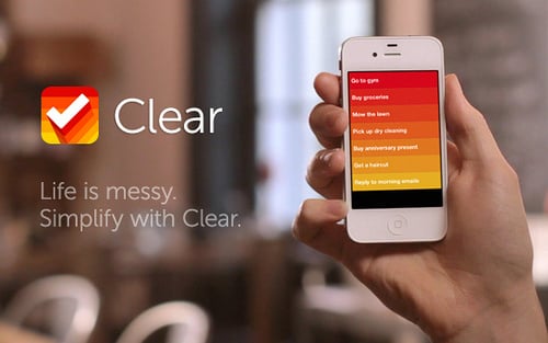
What makes the new Clear app (available only for iPhone at the moment), stand out compared to the plethora of those available is the amazing user interface.
To start, it uses color-coding — like a heat map — to order the importance of your tasks. Bright red at the top signals high priority — the priority fades to orange and then yellow to denote lesser priority. Many people are visual, so this makes a ton of sense.
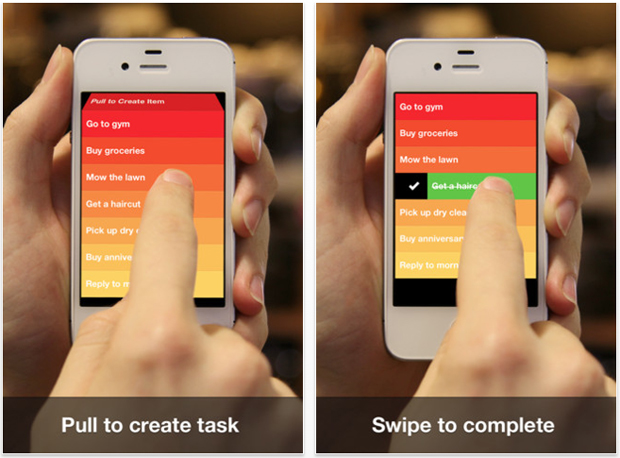
The Clear app really takes advantage of touch in ways I have never seen before. To start a new task you simply pull down on the list. Clear has a really neat cube effect that would make Steve Jobs smile. To add an additional task between two tasks you can pinch them apart. By swiping right on a task it completes it — swiping to the left removes it.
Bottom line: Clear is a new way to use a to-do list and it has made my other previously downloaded organizational applications seem archaic.
I put together a quick video demo of Clear so that you can see it live, in action:
[php function=1]
The Clear app is available in iTunes for 99 cents, and I would recommend taking it for a spin.
Can you see this being useful for you? Do you wish there was an Android version?

