This article is a collaboration between Mike DelPrete and Aziz Sunderji and was shared here with the permission of DelPrete for Inman Intel, a data and research arm of Inman offering deep insights and market intelligence on the business of residential real estate and proptech. Subscribe today.
There is an abundance of data about the U.S. housing market — and for every metric, there are an infinite number of ways of slicing and dicing the data.
Why it matters: What’s needed is a way of simplifying the data – ultimately, data should tell a story and provide meaning.
- This week I am teaming up with real estate data visualization specialist Aziz Sunderji of Home Economics to contextualize last week’s existing home sales report.
 In August, 401,000 homes were sold across the country, and we think the best way to contextualize the data is to compare these figures to the same month in prior years. By this measure, home sales last month were the lowest since August 2010.
 Sales in the West have declined against the long-run average more than in other regions (though the Northeast is not far behind). Transactions are holding up better in the Midwest and in the South.
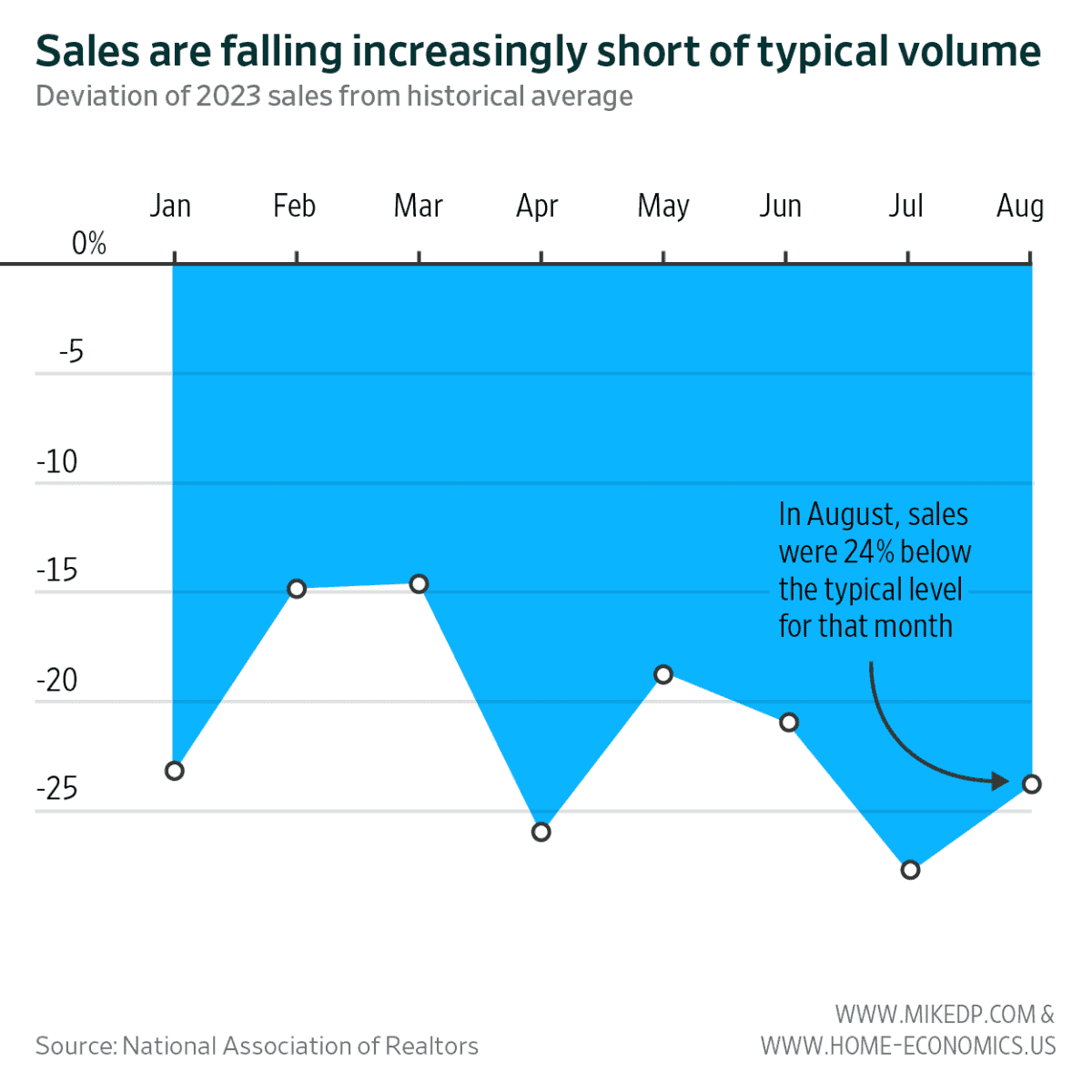
 Momentum in home sales over the past six months has been sluggish and well below historical averages.
 And sales are consistently falling below the historical average, especially during the past five months — although August was a slight improvement over July.
 The current downturn shows signs of similarity to past housing downturns, both in velocity and duration.
 Our ask: Use these charts. Include them in your own research and use them to educate consumers, board members and peers.
- The more we collectively understand the data — and make meaning from it — the better decisions we’ll make to move forward with clarity.
Mike DelPrete is a strategic adviser and global expert in real estate tech, including Zavvie, an iBuyer offer aggregator. Connect with him on LinkedIn.


