The National Association of Realtors’ move to change its logo for the first time in 45 years has drawn such ire on social media that a Change.org petition calling for a repeal had garnered more than 800 signatures by Wednesday morning.
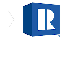
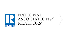
NAR on Monday announced that the new logo — an iconic “R” printed in a bold sans-serif typeface called Montserrat along a tilted blue cube — would be phased in over the next two years, starting in June. It’s estimated to have cost approximately $250,000. NAR CEO Bob Goldberg confirmed the cost on Tuesday in a comment on Linkedin.
“If you look at the major real estate groups on Facebook, you will see the outrage that rebranding so poorly has caused,” said Chris Farrugia, a Realtor with Premier Plus Realty based in Naples, Florida, who launched the Change.org petition Monday. “This brand that we are forced to pay to belong to used our money to take our brand backwards (as many of us see it).”
The petition — which can be signed by anyone, not just NAR members — has yet to reach its 1,000 signature goal. NAR currently boasts more than 1.3 million members.
“This change was an irresponsible use of funds and we, the members, should have been involved in the change,” Arieli Puffer, a Michigan Realtor with Keller Williams wrote in the comments of the Change.org petition. “Furthermore, if a new logo was absolutely essential, a more professional and clean design should have been implemented; not a 2D box that looks like something out of a video game. We take our careers seriously, and as such, the logo should represent its members as the competent professionals that we strive to be.”
Such a negative initial reaction is not uncommon during a rebranding effort, said Dustin Longstreth, chief strategy officer at CBX, a branding agency with offices in New York City and Minneapolis.
Early last year, for example, students at Quinnipiac University appealed to the school after a rebranding effort changed the word “university” to all lowercase letters. Likewise, when the University of California announced a new logo in 2012, a petition calling on officials to save the old branding drew 54,000 signatures. A week later, the new logo was scrapped.
“Whenever changes happen there’s always a lot of grumbling,” Longstreth said. “People don’t like change fundamentally. But then, soon enough, this becomes the standard and people just assume this is the thing that’s been around forever.”
In a statement, Goldberg thanked NAR members for their vocal response to the change and promised to monitor the feedback.
“We want to sincerely thank every member who has taken the time to share his or her opinion on the logo redesign since it launched yesterday — the good, the bad, and the ugly,” Goldberg said in a prepared statement emailed to Inman on Wednesday. “Your voice matters, we are listening and we will continue to process your feedback.”
“We’re grateful because your reactions show how much you care about our valuable membership mark. We get that,” added Goldberg, who said the $250,000 price tag also included more than a year of consumer interviews, focus groups and member surveys. “You are proud to be Realtors and we are proud to serve you. We can assure you that the new logo was not developed without extensive qualitative and quantitative research and feedback solicited from consumers and members. Our design firm, Conran, did not just create a new logo. They helped us articulate our visual identity.”


