Just four years ago, four out of 10 home searches on Trulia came from mobile devices.
Today, the figure is seven out of 10.
One takeaway is that a property search tool’s mobile experience is at least as important as its desktop site.
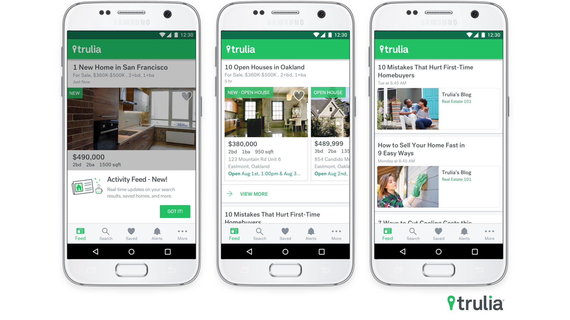
Bearing this in mind, Trulia has redesigned the home page for its for-sale and rental apps, aiming to tailor its design to a user’s specific interests.
The new home page, which Trulia calls its “Activity Feed,” is available for both the iOS and Android versions of its apps and resembles the personalized format of its desktop site.

Now, whenever users open the app, the Activity Feed will show information that is likely to pique their interest, such as new listings that match their search preferences, for-sale homes that have undergone price or status changes and upcoming open houses, according to Trulia.
The Activity Feed also sprinkles in market research and home tips.
“This can be anything from advice on how to save up for a down payment or how to decorate a rental on a budget, to the latest housing economics reports on inventory levels or the cost-benefit analysis of renting versus buying,” Trulia said in a blog post.
Trulia cherrypicks the information based on a prospective homebuyer or renter’s past search activity. Part of its process involves using machine learning, which refers to a self-updating statistical model that analyzes data, recognizes patterns and makes predictions.


