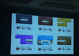
- Functionality and usability go hand-in-hand in this updated user interface.
Have suggestions for products that you’d like to see reviewed by our real estate technology expert? Email Craig Rowe.
Ixact Contact was a surprise to me. It hadn’t been on my radar until I was made aware of it by a reader (What does Brad always say about Inman?) who had interest in my opinion on it.
My review was largely positive, but I admit to dancing around some of the issues I had with its user interface.
The current version isn’t bad; it’s just not great. A tad dated.
And when a tool can do all of what Ixact Contact can, I sometimes eschew a pejorative comment or two in favor of something I think is more value to you, the reader.

I’m happy to say I’ve been privy to a new version of this robust system, and that current users and aspiring customers are in for a very nice surprise.
What I saw was mostly a complete visual overhaul of the current Ixact Contact solution.
The ubiquitous contact access list was moved to the right of the screen in subservience to the main navigation bar, which was realigned vertically on the left to better accommodate access to a growing list of features. (I fear that could come back to haunt them, however.)

The dashboard can be compacted to streamline your view and eliminate the text descriptions of the icon-based navigation. That would be how I would work, as it provides a cleaner look and broader workspace. The ergonomics are better.
The tablet-view workspace is equally condensed and succinct.

The colors have all been softened to ease transition through content areas and encourage interaction with adjacent features.
The typefaces have been cleaned up and enlarged so users don’t feel like they’re running into a wall of text.
Ixact Contact offers several ways to dive deep into a contact, including social mentions and spouse or partner information. It was critical for them to ensure that individual contact pages excelled in making data quick to access and absorb. It’s the heart of any such solution.

I equate the new design for this feature to a LinkedIn profile. It’s easy to get what you need before making your call or sending an email.
These new design features make accessing tools quicker and create a less clinical overall look and feel. It’s like going to work in a modern, open office as opposed to a dreary cube farm.

Sure, you can be productive in either, but wouldn’t it be nicer to enjoy the space around you?
Ixact Contact is aiming to launch the new interface by the end of the year.
The company told me there’s a good deal of work left to be done, but I trust the final product will hold up to what I saw this week.
Have a technology product you would like to discuss? Email Craig Rowe.


