Yossi Langer
SAN FRANCISCO — Amazon Alexa’s artificial intelligence is no match for Yossi Langer’s creative 6-year-old, who likes to use the device to create ridiculous grocery lists — a la “Alexa, we need ‘slimy bugs’ or ‘poopy bags.'”
Aside from a good chuckle, the device isn’t of much use to Langer, who has been solving user experience design, usability and human factors problems for mobile and web applications for 15 years. (He conceded that the backend of the app does ask him for clarification on an important matter: “Which type of poop did you want?”)
At Hacker Connect this morning, Langer shared how real estate apps can ensure they hit the mark on practical use and user experience (where Alexa, which can skirt by for awhile on novelty, still has some work to do), by avoiding common mistakes and innovating ahead of the curve.
He started with 3 mistakes he sees frequently with real estate apps:
1. Featuring dashboards that no one uses
2. Adding customizations that kill innovation and that consumers don’t want
3. Unusable property search
Users don’t use dashboards
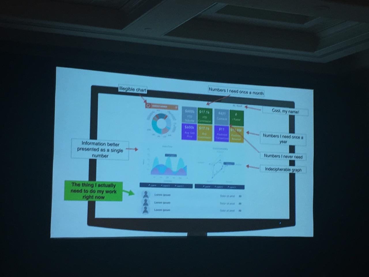
“Basically every CRM has a big beautiful dashboard,” Langer said.
Everybody starts off this way — they demo great, salespeople love them; they look fantastic, he said.

But the problem is once you have a dashboard, it implies that you have to have a lot of information on that dashboard, including lots of pretty (but impractical) charts — not the one or two numbers you need to do your job.
“It forces you into a lot of decisions you might not otherwise make,” Langer added. “We train [users] to ignore dashboards and train them to ignore our products.”
And we can blame George Lucas for our dashboard obsession.

When everything is the most important thing
Say you make an app to improve apartment rental search, and decide to partner with incumbents — big companies that can expand your reach.
You’ve got a slogan, logo and the ability to change the color of the display. The first company says — “That’s great, but there’s no possible way we can use this unless we can add a calendar feature.” And the next one says, “What we really need is a search-by-bath feature, and please move the calendar to the left.”
Another wants its partners’ faces on the display. So now you’re supporting six different versions of the app.

“All these changes taken together mean you end up with a crazy forked database with lots of different features. Every engineer knows this; every exec knows this: There’s no such thing as a small change,” Langer said.
Each one opens the door to an enormous amount of overhead. Your engineers get a case of Red Bull and stay up 48 hours to meet demand, only to quit and head to Google when customers call in angry about a broken interface anyway.
In summary: “Thoughtless customization kills innovation,” Langer said. Know your product, don’t adhere to a sales-driven culture, and:
- Empower your designers to observe and understand your users
- Train the sales teams to sell ease-of-use and simplicity
- Get comfortable saying “no” nine out of 10 times
Nobody cares about your property search features
All property search sites are essentially the same: You’ve got beds, location and (most prominently) price with listings on a map.
“It’s a solved design problem,” Langer said. “Nobody’s confused by this. Everybody gets it.”
So trying to make consumers enter 14 different fields before you hit the “search” button and calling it innovation is a waste of time and resources. And don’t show consumers the 1,000 properties that fit their criteria. Show them the top five. Let’s not make them do the work, Langer said.
Rather, stick to the basics. Make it as easy as possible to get people into your search results. Focus on price, beds, baths and location accompanied by big pictures. Save the progressive filtering — commute time, walkability, etc. — for the “obsessives and nerds.”
Why do these mistakes happen?
“I have a theory that it happens mostly because if a mismatch between company design maturity and market design needs,” Langer explained.
He laid out 4 stages of design maturity in different markets:
1. Technology-driven market (designers are barely involved)
This is the stage when it’s a miracle that a technology even exists because it’s so new and useful.
Think the cellphones of 1985 — heavy, clunky, slow and terrible UX. “A lot of people were willing to pay for access to that,” Langer said, “like Echo when it launched.”
Here’s when a lot of companies go straight to marketing — designing Facebook ads to market their product, for example — Langer said. But they should getting ready for next stage, which is…
2. Feature-driven market
Designers are involved here only after critical decisions are made. Take T9 predictive texting and Snake as add-ons to the first cellphones.
3. Experience-driven market
Designers are collaborating actively during this phase. For example, the iPhone 1 had the best experience, the best way of tying all the features together. But it wasn’t necessarily any more powerful than the Blackberry.
4. Design-infused
In this phase designers are running key decisions and are strategically invested with decision-making power. If you’re in a market like this — like the current iPhone and Android models — having an amazing customer experience is “table stakes, it’s a requirement for succeeding,” Langer said.
How does real estate compare?
Where do today’s real estate technologies fall on the design maturity spectrum? Langer broke it down as follows:
- Virtual reality (VR) tours: Technology stage aka “miracle that it even exists” phase. VR will quickly get to feature-driven.
- Apply for a mortgage online: Feature-driven stage in which the smartest companies are looking ahead and realizing that it’s about who has the best experience.
- CRM: Many companies still think they are on features. Those that break out are winning on a “coherent, consistent, seamless, well-designed, user-focused experience.”
- Consumer property search: Same as CRM.
Bottom line is: Design-infused organizations win. It will push you up this curve faster than your competitors. Here’s how you can get there:
1. Think: Who is that dashboard really for?
2. Practice saying ‘no’ to customization requests
3. Don’t get cute with your property search
4. Understand the design maturity of your market
5. Push your company up the curve by hiring and empowering smart designers


