By Becky Harris; reposted with permission from Houzz
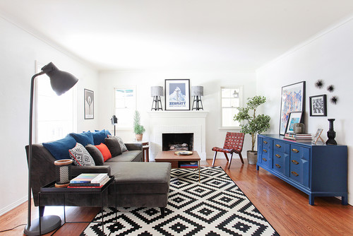
The couple living in this house knew they would be here only for a year or two, but that didn’t mean they couldn’t have a stylish home. Designer Natasha Jansz created a living room in the 40s bungalow that reflects them as a couple and fits their lifestyle, which includes a baby and a dog.
She found stylish pieces at inexpensive retailers like Target, Ikea and World Market that are versatile and timeless enough to take with them when they move out, and that kept the budget under $5,000.
Room at a Glance
What happens here: Gathering, reading, entertaining, playing
Location: Los Angeles
Size: 280 square feet (26 square meters)
Designer: Natasha Jansz
The first thing Jansz did was get rid of the blah beige wall paint. “The ceiling and trim had been freshly painted a white by the landlord, so we tested four whites for the walls to be sure the one we were introducing would blend fairly seamlessly — I’m a big believer in testing paints!” she says.
The winner was Picket Fence by Ralph Lauren. “It’s one of my go-to white paints, because it’s a clean white that looks crisp in contrast with other colors but has a little warmth to it,” she says. (Note: When renting, always check with the landlord before painting.)
Browse More Living Room Designs
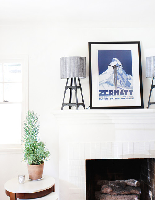
The couple were still developing their taste in art and weren’t ready to make a big investment, so Jansz helped them find something both affordable and meaningful. Because they had gotten engaged in Zermatt, Switzerland, she suggested vintage poster art, and they loved the idea.
“And this art also gave us our color palette — the bright blue, black, white and shades of gray,” Jansz says. A pair of metal tower lamps topped with gray shades fills out the rest of the mantel.
Jansz also gets a sense of clients’ style through their book collections. “I always say, ‘Show me your coffee table books,’” she says. “These books will give a room life.”
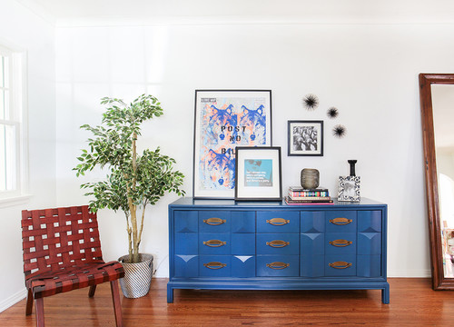
The credenza was a great find at Melrose Trading Post, a popular L.A. flea market. “The wood grain was ugly and it had water stains, but it had nine great brass handles that were all intact, and we knew we could repair it,” Jansz says.
The piece is great for storing games, books and toys and displaying art. It also serves as a bar top and buffet when her clients are entertaining. Jansz’s assistant is a great DIYer and did the fix-up job herself.
Keys for fixing up a piece like this:
- Fill in dings and chips with wood putty.
- Sand the wood to prep it for painting.
- Sand down the drawers to make them glide more easily.
- Apply at least two coats of paint.
- If the drawers don’t glide open with ease, rub a bar of soap on them.
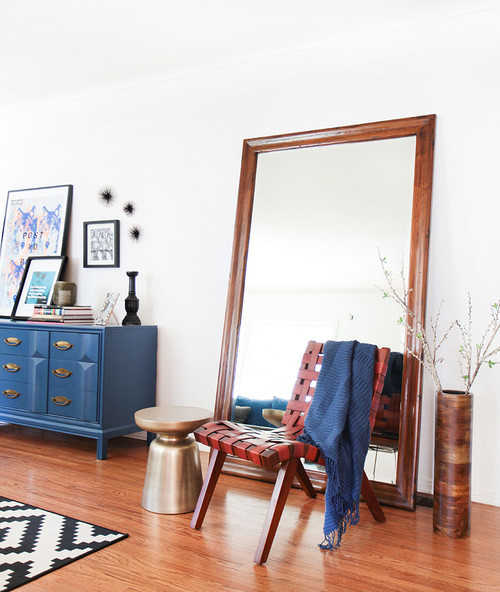
Before Jansz came on the scene, the living room was full of traditional hand-me-down furniture that, for the most part, didn’t suit the family. This large mirror is one of the pieces Jansz kept from that collection. It reflects the light and brings another large-scale element to the room.
My Houzz: Art Deco-Contemporary Mix in Los Angeles
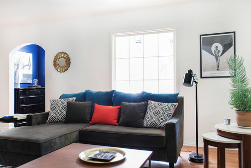
“We played around with different layouts to determine what kind of sectional to buy,” Jansz says. Not wanting to block the fireplace, they chose this spot. There was enough room to float the sofa out from the large picture window.
Because of fences and a porch, privacy was not an issue, so they freed the windows from heavy velvet drapes and kept them bare. “We wanted to embrace the nice mullions and simple lines of the windows,” the designer says. “I love a naked window!”
The sofa is custom. “With a baby around, there was no going white on the sofa,” Jansz says. The dark gray fabric is durable, and she added contrast with pops of orange and red on the pillows.
Brighten Your Space and Experiment with Scale at the Same Time
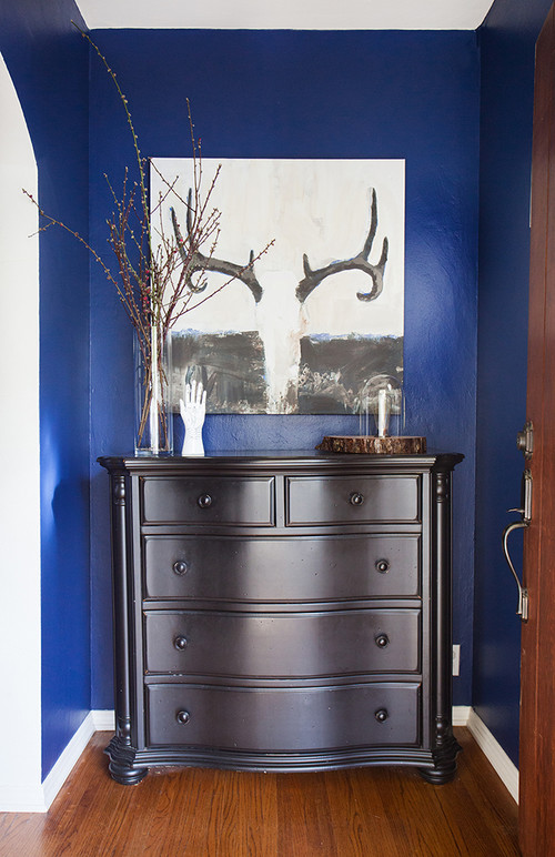
You may have noticed some brilliant blue peeking out in the previous photo. As part of the project, Jansz also created an entryway landing zone. As you open the front door, a dresser repurposed from the couple’s bedroom and brilliant blue greet you, along with a painting that fits in with the color scheme.

