By Carol Crotta; reposted with permission from Houzz
This sophisticated couple in their 70s wasn’t even engaged when they purchased a narrow row house together in the historic Capitol Hill district of Washington D.C. and hired architect Janet Bloomberg of Kube architecture to renovate it for them.
“They got engaged during the process,” Bloomberg says, “and then got married in the house during construction.”
They wanted a house in which they could entertain with style and in which they could grow old. Bloomberg juggled both demands expertly, with careful thought given to maximizing impact while respecting the original structure and preparing the house for comfortable future living.
“It’s sort of symbolic for them,” Bloomberg says. “They say a marriage is under construction, just like a house. Exposing the inner workings of this house is like exposing a relationship. We like the idea that you see how it’s made.”
Houzz at a Glance
Who lives here: A couple in their 70s
Location: Washington D.C.
Size: Main and second floors: 2,350 square feet (218 square meters); 2,980 square feet (277 square meters) with third-floor guest suite; three bedrooms, 3.5 bathrooms
Architect: Janet Bloomberg, principal of Kube architecture
The homeowners “didn’t have a physical vision, just things they like that they shared with us,” Bloomberg says. Among their preferences: the “feel of a New York loft, very modern and minimal; black and white and gray palette with pops of color; efficient; ultra-clean; not decorative,” she says.
Without children to raise or a future sale to consider, the couple were willing to give up square footage and an extra bedroom to remove the back half of the second floor, opening the rear of the house in dramatic fashion.
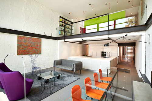
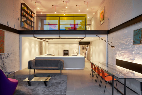
A space that was once cluttered with interior walls, 8-foot ceilings and a warren of small rooms now offers a clear view from the entry straight to the garden’s back wall. Bloomberg grouped the kitchen, powder room and an elevator into a central core, as she refers to it.
This “not only improved the flow from front to back, but also made room for wheelchair-accessible walkways around the entire floor on both levels,” she says.
Mix and Match for a Touch of Creativity
The wife had the idea of exposing the brick under the plaster — “always kind of risky and expensive,” Bloomberg notes. “And it could be a mess.”
While the walls weren’t perfect, they did add texture and character to the modernized space. Bloomberg painted them white, making them a good backdrop for the couple’s artwork.
“It makes it look clean,” she says, “and allows the light to go through the whole house.”
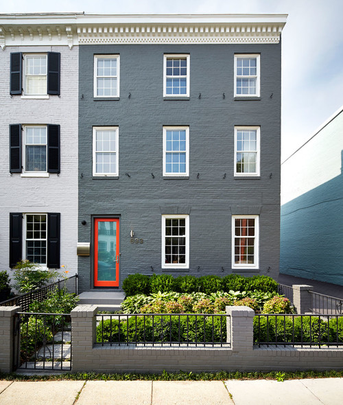
Only the sassy, orange-rimmed door gives notice that this traditional 100-plus-year-old Georgian row house, with its wooden dentilled cornice and symmetrical double-hung windows, has a few surprises waiting inside.
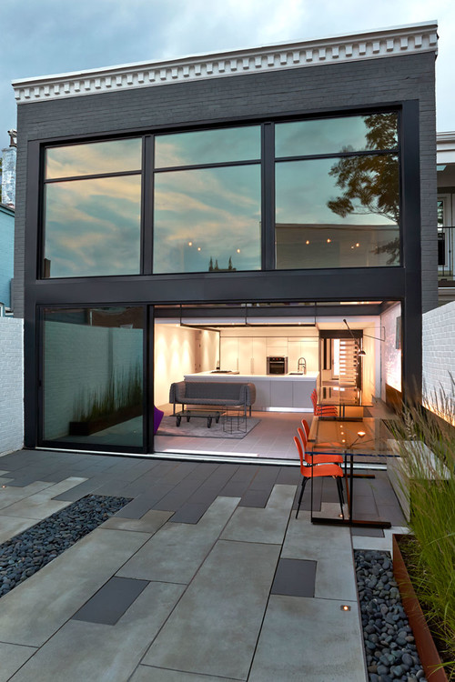
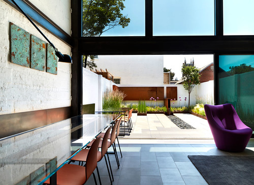
Bloomberg retained the wooden dentilled cornice but replaced almost all of the brick back wall with two stories of ultra violet/heat-resistant coated insulated glass, framed in no-maintenance aluminum-wrapped steel. Two of the three first-floor glass panels slide to the side to create a 14-foot opening. The doors are made of thermally broken aluminum, with inner and outer glass panels separated by a gap to eliminate condensation in extreme temperatures.
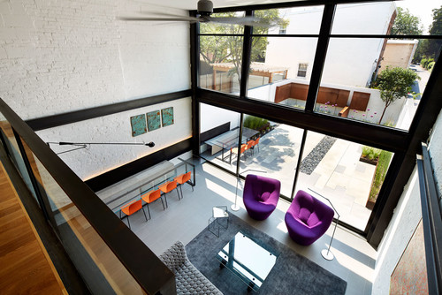
The glass wall makes all the difference in the design. Not only does it enlarge the space visually and allow natural light to flood into the otherwise dark central core, it creates a nearly seamless transition from indoors to the outdoor patio — a plus when the homeowners are entertaining large groups.
At night, the interior is flooded with light reflected by the whitewashed brick. The centrally located kitchen is lit like the stage it becomes when one of the homeowners cooks. The blackened-steel seat-back on the dining area wall conceals a perimeter of glowing LED lighting.
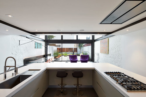
The original kitchen was also set midfloor but faced the side of the house. Bloomberg designed a giant U counter, and set it squarely central, accessible from hallways on both sides. “She loves to cook,” Bloomberg says of her client. “She lives at this helm in the middle of the house.”
Since the client uses the space as an office, Bloomberg unconventionally placed two counter seats inside the U facing out with a view to the garden.
The Italian Pedini cabinets offer “tons of storage,” Bloomberg says, including a tall wall of cabinets at the back as well as storage space in the outer part of the U. One of the vertical handles along the back is for the refrigerator, while the other opens to a 14-foot-deep, walk-in pantry, part of the old kitchen space. A pair of dishwashers facilitates entertaining.
Another nod to universal design: The plates and glassware are stored in lower cabinet drawers.
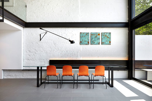
An example of rough juxtaposed against refined, the dining area has a 12.5-foot-long (3.8-meter-long) glass-top table set on a slender steel frame, next to a bench with a built-in, blackened-steel seat-back and a cement composite Viroc seat. Bloomberg planned for cushions on top of the bench seat, but “it’s very comfortable as is,” she says. “She likes it without the cushions.”
The dining area has a visual trick: The bench with its back continues along the wall outdoors, with a 6-foot-long (1.8-meter-long) matching table and chairs. Adding to the blurred lines is the flooring, a ceramic porcelain tile — smooth inside the home, textured outdoors — that continues straight out the glass doors, where it weaves into poured concrete paving.
“We wanted the tile all the way through the house, and I had the definite idea that I had to make it feel tied together for consistency,” Bloomberg says. “It feels very European to me. And it’s nice [that] when it’s raining a bit and the doors are open, they don’t have to worry about the maintenance.”
My Houzz: Hip Style for a Row House in D.C.
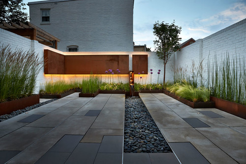
“The garden is a really important component for them,” Bloomberg says. “They entertain a lot, and they wanted to make it a beautiful place to be.” To further blur the division between indoors and out, Bloomberg continued the interior tile pavers outside, switching to a textured finish and weaving them in with matching poured concrete pavers and jutting Cor-Ten steel planters.
Cor-Ten also makes a major appearance in paneled lighting at the back and side garden walls. A slender fountain sends water down a pebbled course that hides the drainage system. “I like the idea of using different kinds of steel and different textures of the same kinds of materials,” Bloomberg says.
At night, the patio is softly illuminated with planter-level lighting and lights hidden in the Cor-Ten steel wall panels, similar to the perimeter glow of the blackened-steel panels in the dining area.
This view from above illustrates the amount of blackened-steel, including two side I-beams, used to frame the glass back wall and to reinforce the brick walls, which now are minus a good deal of the second floor.
“The minute you take off that floor, it wants to rack and you have to brace it,” Bloomberg says. Cooling a volume this size, especially in notorious D.C. summer heat, can be tricky. Bloomberg installed a 96-inch industrial fan in the ceiling to pull in air and circulate it to both levels. The second-floor, glass-paneled blackened-steel railing echoes the look of the window wall, lending a visual cohesiveness. The wide-plank clear maple flooring here is new.
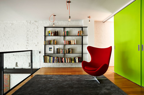
The second-floor loft space, with its view of the public areas below and the outdoor patio beyond the windows, houses a library and seating area as well as the master bedroom and bathroom. A scattering of single bare bulbs suspended from colored cords adds a fresh and whimsical touch.
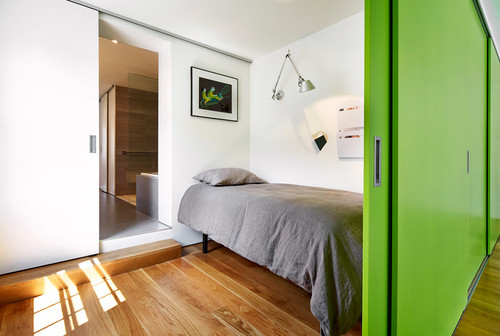
Behind the sliding green panel doors is a sleeping nook “for the more intimate friends or relatives,” Bloomberg says, “because it is close to the master bedroom and bathroom.” A more formal guest suite is located on the third floor, along with an office for the husband.
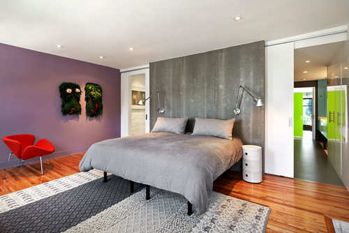
The master bedroom, which faces the street, can be accessed from either hallway. The unusual headboard is fashioned from Viroc, an inexpensive concrete composite that Bloomberg also used for the dining bench and for some of the flooring. “Everyone loves it,” Bloomberg says. “They don’t realize they stepped on it on the stair landing. It looks fabulous vertically.”
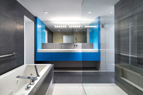
The master bath is “one of my favorite bathrooms I ever designed,” Bloomberg says. “It’s not a large space, but we made it look very luxurious” with a combination of high-grade materials and a brilliant blue accent in the form of the cabinetry. The vertical medicine cabinets framing the mirror are custom, as is the 9-foot (2.7-meter) white Corian vanity counter with built-in trough sink.
Enhance Your Home’s Curb Appeal
Thinking ahead, Bloomberg designed the shower, which sits flush with the floor and has no door, to be large enough to accommodate a wheelchair if need be. She also custom-designed ADA safety grab bars in the separate toilet compartment, whirlpool tub and shower. As on the first floor, a walkway encircles the second floor’s central core, and part of it passes through the bathroom.
“We marked it with a textured runway gray tile to make sure it’s clear,” Bloomberg says.
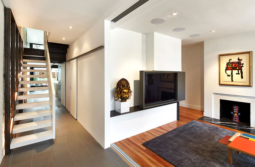
What was once the front room is now a media room, since most of the public space is at the back of the house. Bloomberg retained the older pine floor in this area, but replaced the rest of the wood with tile flooring. The media room closes by way of aluminum-framed, frosted-glass sliding doors. The back walkway (with wood floor) leads first to the elevator — another important component for aging in place in a multistory home — and then to the kitchen and living room area beyond.
“The elevator was very challenging,” Bloomberg says. “It was very small, but it would fit a wheelchair.” Across from the staircase, a pair of doors at right conceals a vestibule leading to a coat closet and the powder room, and stairs to the basement.
“There’s a strong combination of fine-tuned decorative steel up against the stronger, more industrial structural steel,” Bloomberg says. “That juxtaposition was a strong design element for this project.”
A case in point is the first-floor staircase, in which the blackened-steel framework bolting the stair to the walls contrasts the white steel treads and white railing with frosted-glass panels. Bloomberg’s mix of refined and rough materials is also evident in the aluminum-grate landing that intersects with the second floor’s wide-plank clear maple flooring.
Bloomberg looked to the couple’s art collection when deciding on accent colors, like the orange of the dining chairs and the blue of the dramatic first-floor powder room.
“They really put everything into this house,” Bloomberg says. “This is their dream house, where they want to be for the rest of their lives.”
The renovation included the installation of a “smart” home system and photovoltaic panels on the roof, which is lined with solid foam insulation. Equally important to the green components, however, was consideration of the homeowners’ needs as they grow older. For example, the elevator lets them access the second-floor master bedroom and bath and laundry.
“All the main necessities are accessible from the elevator,” Bloomberg says.

