By Marianne Lipanovich; reposted with permission from Houzz
San Francisco architecture is known for its Victorian “painted ladies,” Art Deco buildings and Marina-style homes (with their ground-floor garages, banks of windows and flat roofs). But an Eichler in the city is much rarer: Houses designed by Joseph Eichler typically populate the surrounding Bay Area suburbs, not the urban core.
So when the owners found this home, part of a small enclave of Eichlers in Diamond Heights, they knew it was special. Working with architect Michael Hennessey, they set out to restore the house — a project that included overhauling the living area to capitalize on stunning views.
Who lives here: Family of four
Location: Diamond Heights neighborhood of San Francisco
Size: 320 square feet (29.7 square meters)
Year remodeled: 2014
Designer: Michael Hennessey Architecture
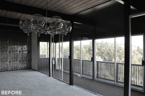
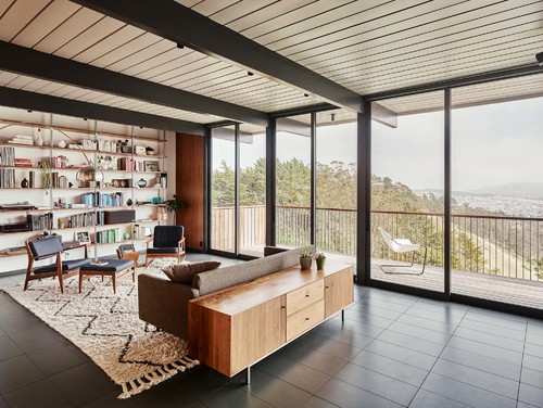
AFTER: Hennessey removed the enclosing windows and restored the deck. He added 10-foot-tall sliders along the restored exterior wall to let in more light and expand the view.
The homeowners didn’t want a retro design, but they did want to retain the midcentury feel and incorporate materials that are in keeping with that style. They also wanted a more open layout that would take advantage of the view. So the team took the living room and adjoining dining area down to the studs and rebuilt them in a more open layout.
In addition to having iconic midcentury modern architecture, the home overlooks a canyon in the foreground and the southern stretches of the city beyond. And in true San Francisco style, the house varies from the traditional one-story Eichler layout. Here, the main living area is on an upper level, with the bedrooms below.
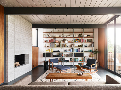
The homeowners finished off the Dieter Rams shelving system with custom wood shelves they made themselves. They had collected the rest of the vintage midcentury furniture over the years.
Houzz TV: Reinvigorating a Gable Eichler for a Family
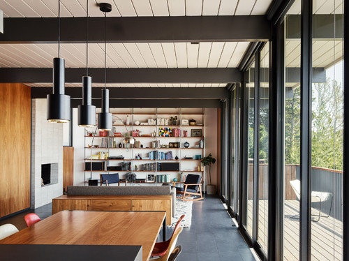
The large-format ceramic floor tiles tie the living room to the dining area and kitchen, and provide an additional contemporary touch.
Although Hennessey specified new materials for most of the remodel, he kept the original posts and beams, which were repainted. He also kept the original tongue-and-groove ceiling, which extends to partially cover the deck, and had it painted white to brighten the interior even more. The ceiling extension over the deck helps make the transition between the interior and exterior feel seamless.
“We paid attention to details,” Hennessey says.
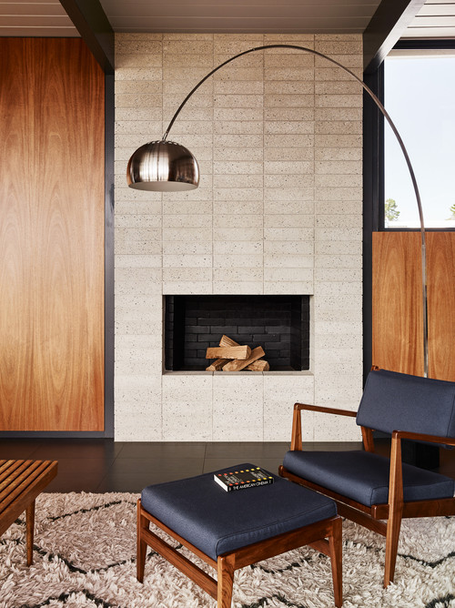
A new cladding of concrete blocks gives the fireplace a more modern look.
Tie Your Styles Together With Consistent Flooring
The original walls had dark mahogany panels that are typical of this style of home. Replacing them with lighter plain-sliced mahogany veneer panels keeps the room’s midcentury feel but provides a fresh update.

