By Mitchell Parker; reposted with permission from Houzz
Houzz at a Glance
Who lives here: A couple in finance
Location: Tribeca, New York City
Size: 3,000 square feet (279 square meters); three bedrooms, three bathrooms
Architect Andrew Franz didn’t want his clients to pass up an opportunity that comes only once in a lifetime. The couple, both in finance, were looking to buy a place in New York City that would require only modest renovations. But when Franz saw a messy unfinished studio with raw concrete floors, he urged his clients to jump on it.
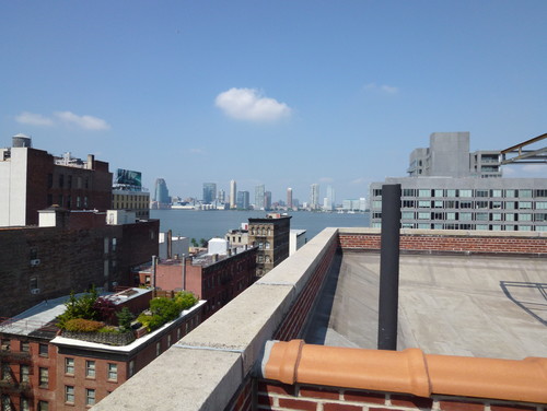
Why? The unfinished unit occupied the top floor of a low-key building in Tribeca, one of New York City’s most desirable neighborhoods. The top position gives the unit roof rights, meaning whomever renovated it could create a dramatic outdoor space — an extreme rarity in the city — overlooking the Hudson River.
“They would have carte blanche to do what they wanted with it,” Franz says. “You don’t stumble on something like this everyday.”
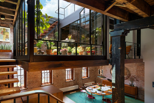
But if an outdoor space is hard to come by in the city, try an outdoor space indoors. To get that one-of-a-kind amenity, the couple and Franz punched a hole in the roof to create a suspended glass-encased garden that hangs like a green oasis right in the loft interior, shown here.
Keep Your Patio Looking Smooth and Sleek
Franz felt that his clients might not be inclined to use a rooftop garden if it remained unseen. By dropping a portion of the garden into the interior, the homeowners can enjoy the view and be encouraged to venture up and outdoors. “It’s like a micro courtyard,” he says.
The drop-down garden also allowed light to flood into the unit “rather than cutting a million skylights in the roof,” he says.
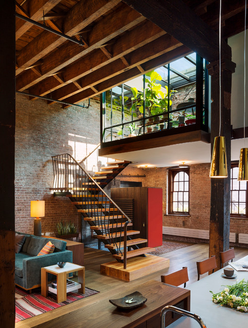
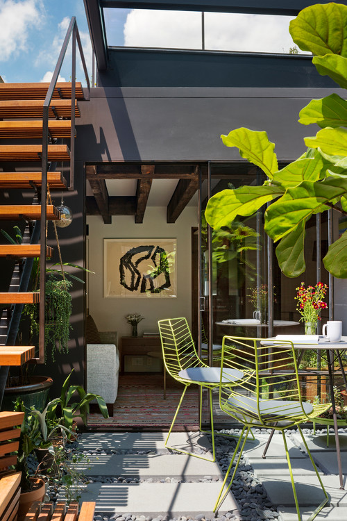
Franz used the ceiling joists he cut out for the garden to create the staircase treads and landings. The railings are blackened steel. The garden is part of a mezzanine that includes a small seating area to the right.
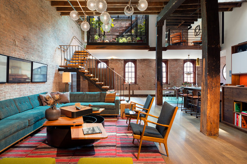
Furnishings in the loft are a mix of vintage and custom pieces. Franz and his firm designed the sofa and coffee table, and the end table is part of his firm’s furniture line. Many of the bought pieces are vintage Danish designs. The chandelier came from a former East German parliament building.
A fire many decades ago charred the columns, which were then painted over by previous owners. Franz tried having them stripped and sanded, but his crew couldn’t get through the blackness.
“I was alarmed at first but then realized it’s quite beautiful, and we embraced the charred finish,” he says.
The columns are also twisted and distorted, a fact made more prominent when Franz brought in the more finished straight lines of the mezzanine and cabinetry. “I learned a long time ago that you have to embrace your obstacles,” he says.
Bluestone pavers and river rock form the base of the garden floor. Though there’s a drain in the floor, the garden also has a retractable roof that can close the area off to rain and snow.
BEFORE: Previous owners had done nothing with the rooftop, which enjoys views of the Hudson River.
AFTER: The area now features a partial green roof and deck with sitting, dining and grilling areas. Most of the plants are what would be native to the area. This angle shows the retractable roof, which slides over the opened portion to keep rain and snow out when needed.
“Outdoor space in New York is a precious commodity,” Franz says.
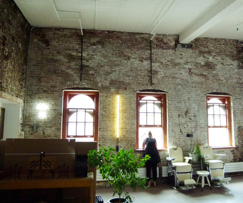
BEFORE: The building had been converted to lofts in the 80s, Franz says, but only modestly. Before that, the unit was once a warehouse for caviar, so when Franz’s clients bought it, the floors were still raw concrete with drains in them (to allow ice to melt and drain away). The vast expanses of brick wall were painted and tarred (to aid in refrigeration). It took Franz’s crew a long time to restore all the brick. “It wasn’t pretty,” he says.
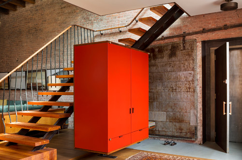
AFTER: A custom cabinet and bench create a vestibule, and screen the entry from the rest of the apartment.
Houzz Tour: British Charm and the Look of a New York Loft
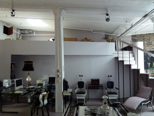
BEFORE: The unit previously had a mezzanine, but it was in an area beneath the gull-wing roof that made you have to duck beneath pipes to move through it.
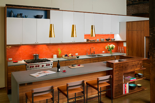
AFTER: Franz moved the mezzanine level to the wall of windows and created a new kitchen in its former location.
He kept the material palette simple. Most of the wood in the apartment is American walnut. Any stone is bluestone, including the countertops and floors in the kitchen. And all the tile, with a few exceptions, is from Heath (in 11 colors).
“There was a strong intent not to have a million materials,” he says.
A raised portion of walnut cabinetry conceals messes left in or near a second sink. “That way, when you’re in the living room, you don’t feel like you’re staring into a kitchen,” he says.
Tall cabinets allow the space to look more proportional in scale.
The top of the cabinets align with the bottom of the mezzanine and a bank of custom cabinets in the living room. “It creates a nice datum all the way around that’s calming and consistent,” he says.
The kitchen is open to the living room. Franz exposed the ceiling joists by removing a hammered tin ceiling. “The goal was to maintain transparency and openness,” he says.
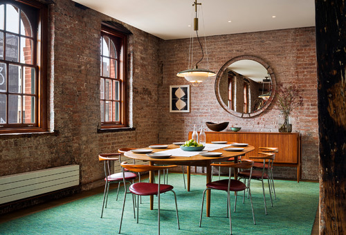
A dining area sits beneath the mezzanine and features all midcentury Danish furniture. “The clients were very sympathetic to that period and the craftsmanship and aesthetic,” Franz says.
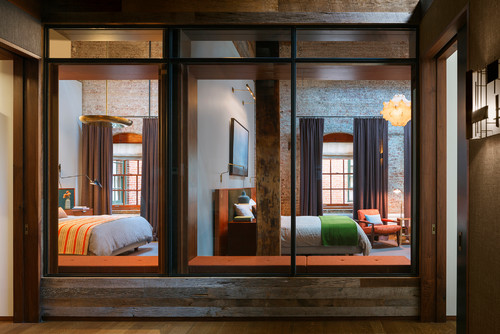
A bank of interior windows separates the guest bedrooms from the rest of the loft, and helps light bounce through the spaces.
The guest bedrooms feature the same vintage midcentury modern stylings found elsewhere in the loft. They also showcase custom headboards designed by Franz.
Create the Illusion of a Larger Entryway
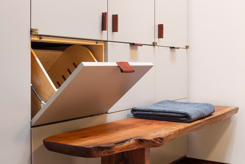
A bench made of live-edge wood sits in a dressing room that’s part of a guest hall. The custom cabinets open with custom leather pulls.
Small-format subway tile from Heath creates a soothing feature wall in a bathroom.

