- Card design is everywhere -- thanks, Pinterest. This layout makes it easy to communicate multiple messages.
- Nothing beats videos when it comes to fostering interaction or conveying a story.
- Keep your design clean and your information well-organized.
The essence of a great real estate website is the ability to communicate a story. Storytelling and communicating the right message are what separate great Web design from good Web design. In 2016, storytelling will continue to emerge as the core competency of the best real estate sites.
Here are 10 design trends that will help you tell your story this year:
1. Card layout
Pioneered by Pinterest, card design is everywhere. Each card represents a different concept or message. The layout makes it easy to communicate different messages and rearrange the blocks for responsive sites.
2. Hidden navigations
Hidden menus have been increasingly popular, and they provide an effective way to save space. Hidden menus allow sites to have more complex navigation without cluttering up the design. They also work well on mobile devices.
3. Full-screen video
When it comes to fostering interaction or conveying a message, nothing beats video! Modern Internet users tend to prefer videos and images over text. As such, incorporating a video background in your Web design can actually go a long way in bringing your story to life.
4. Engaging property details pages
Your customers spend more time looking at properties than any other page on your site, but often this is the page that becomes the most cluttered. Keep the design clean with well-organized information.
Also, provide clear calls to action so the user knows how to get the information they are looking for. Local community information can also help augment the experience.
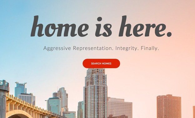
With the rise of responsive design, full-screen tiles are hot this year. Tiles allow the designer to use all the space on the site to the best of its ability with full-screen images and colors. This design style relies heavily on having good photography and typography.
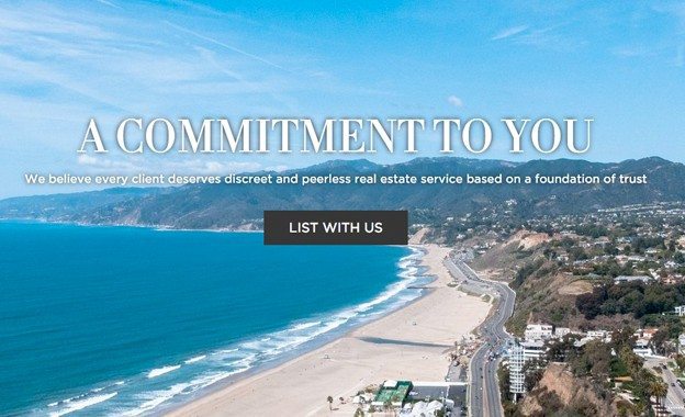
7. Seller-focused websites
With the proliferation of online portals, some brokerages have decided to make homesellers the target of their website messaging. This allows for increased creativity in telling the selling story, untethered from IDX limitations.
Brokerages opting for this route will find that crafting the right message and establishing trust with their potential clients is essential.
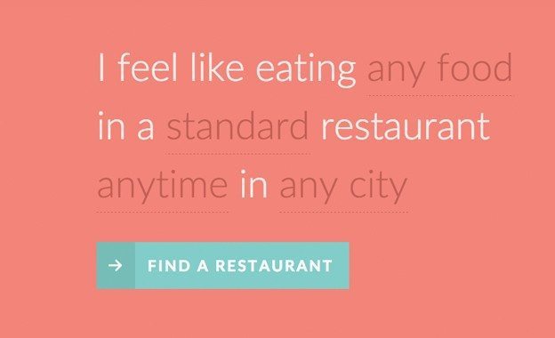
8. Natural language forms
On most websites, forms are uninspiring and perceived as a simple way to collect data. This is a critical point of decision for a user: Do I give the site owner my information or not?
Natural Language Forms humanize the lead capture process and help users feel more comfortable in giving you their information.
9. High-quality moving images
A cinemagraph, or moving image, expresses more than a still photo but uses up less bandwidth than a video. It can also liven up your site’s background, break up excessively long blog posts and keep a curious visitor entertained.
10. The long scroll
Mobile devices have ushered in the long scroll, a feature that keeps the main content on a single page. The technique works well for sites that want to tell a story as you scroll down, allowing users to get the overall message before clicking for more info.
As with any storytelling experience, your audience wants to be engaged and excited to know what comes next. Following these design trends is an effective way to help convey your personal message, tell your story and get your audience to come back for more.


