- You want a clear action for someone to perform before they scroll down a page.
- In an age when people are driven by photography more than text, photos are the most important part of your listing.
- Providing a map further helps potential buyers see themselves living in the area, but make sure the map can be zoomed and manipulated.
Individual property websites for listings have become more popular over the past few years because technology has made it easier to make professional-looking sites at a lower cost and in a shorter amount of time.
At Charlesgate, we have included — as part of our marketing services — a custom property website for all of our listings that is designed to not only showcase the home beautifully but also work as a lead-generating machine.
We spent hours researching the components of a site that are relevant to potential buyers and offer advantages to sellers and the agents representing the property.
Here are eight parts of a property website you want to include:
1. A call to action above the fold
Accomplishing this is simpler than it sounds and crucial. You want a clear action for someone to perform before they scroll down a page (hence “above the fold”).
For the purpose of these websites, we ask them to book an appointment to view the property — the most common-sense next step after visiting the site. Take a look:

2. Professional and beautiful photography
Having a professional take the photographs of your listing is one of the biggest bangs for your buck in the process. How many listings have you seen on the MLS that are dark, blurry or full of clutter?
In an age when people are driven by photography more than text (think Instagram), photos are the most important part of your listing. Make sure you are putting your best foot forward with excellent photos.
3. 3-D walk-through or floor plans
Buyers want to be able to envision living in a space with their furniture and belongings. A 3-D walk-through gives them the ability to do that in a home they have not seen — or only seen for a few moments. Not everyone is as visual as others, so giving them every tool possible is a great advantage.

4. Area amenities
Living in a home is more than the four walls that encompass it. It’s about the neighborhood and all the great spots in it.
Paint a picture to a potential buyer about what it will be like to live in the community.
Where will they get their morning coffee? Where is the closest dry cleaner and grocery store? Buyers consider all of these things when thinking about a purchase.
5. Map
In addition to the area amenities, a map is a valuable addition to the site — especially to a potential out-of-town buyer. The map allows people to gauge how far their commute to work or school might be and other things that are important to them.
Ideally, your map should be able to be zoomed and manipulated so they can get a good sense of the listing’s location.

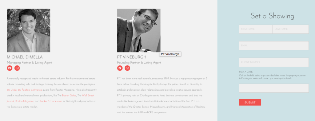
6. Agent information
Make sure you showcase the agent clearly because the website serves as a branding tool for their services as well. A picture and short bio are an excellent way to make a buyer feel more comfortable contacting the agent for more information or setting a showing.
Also, links to an agent’s social media such as LinkedIn or Facebook are an excellent way to build trust with a buyer and help them get a better understanding of working with the agent might be like.

7. SEO and keywords
Sometimes what you don’t see is as important as what you do. A website can be beautiful, but it’s vital that it’s a lead-generating machine and optimized for search engines and keyword searches.
Make sure you spend the time on the back end making your website as search-friendly as possible considering the neighborhood and many aspects of the home that people might be searching.
8. Responsive design
It’s amazing how many websites are still not responsive when more than half of people spend more time on the Web on their phone than a desktop.
It’s vital that your property website is mobile-friendly and that all components can be accessed through any device — phone, tablet, desktop, etc.
Take these eight tips to go forth and make a killer property website.
Gregory Kiep is the director of marketing at Charlesgate Realty. You can find out more about him at GregoryKiep.com or follow him on LinkedIn or Facebook.


